Clear
Make complex information understandable, useful, and easy to act on.
 Brand Standards
V1.0 · 2026
Brand Standards
V1.0 · 2026

Brand standards
The brand idea
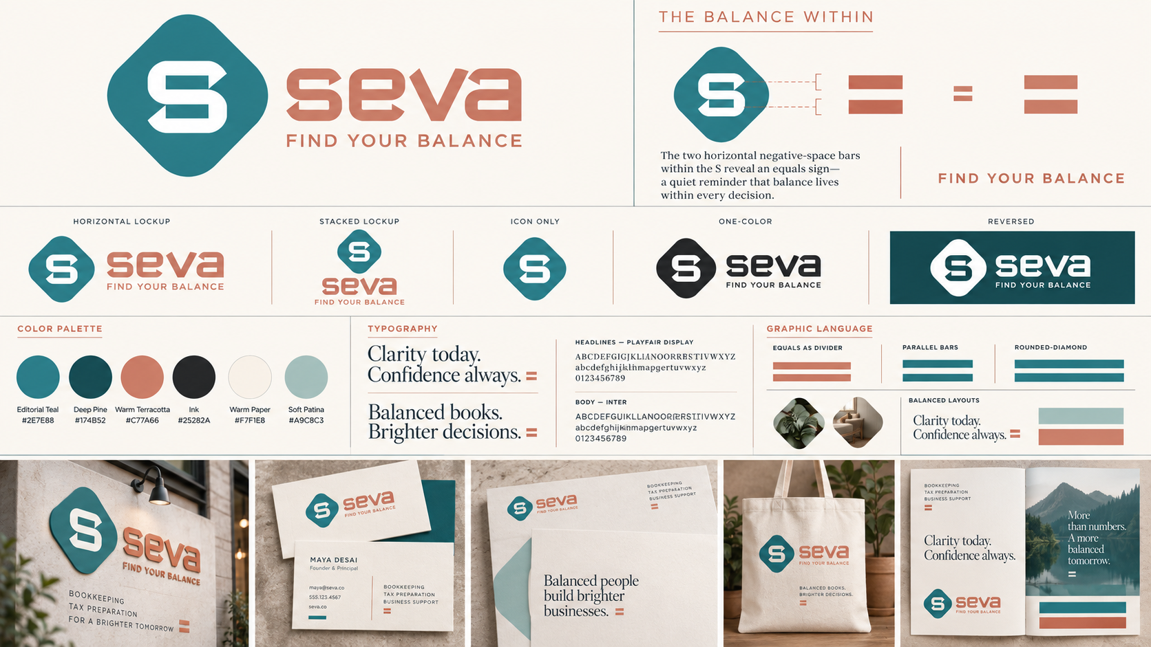
SEVA brings calm, clear financial guidance to thoughtful business owners. The identity pairs precision with warmth: a dependable system that feels human, never cold.
The squared negative space inside the S reveals an equals sign. It is the quiet center of the brand—a reminder that better decisions begin with balance.
Make complex information understandable, useful, and easy to act on.
Lead with accuracy, thoughtful process, and dependable partnership.
Help clients move forward with confidence rather than fear or pressure.
Brand promise
SEVA turns financial complexity into clarity—so business owners can make balanced decisions with confidence.
Use the full horizontal signature whenever space allows. The tagline completes the brand promise and should remain present in high-visibility communications.
Preferred for websites, presentations, signage, stationery, and client-facing materials.

Use when the brand name must remain readable at a smaller scale.
For avatars, favicons, environmental details, and established-brand contexts.
The two horizontal bars are taken directly from the negative space of the S. Their squared, 90-degree corners are an essential part of the idea and must never be rounded or redrawn.
Keep at least one “x” on every side. “x” equals the height of one negative-space bar inside the S.
Primary signature: 220 px wide. Secondary signature: 140 px wide. Symbol: 28 px wide.
Primary signature: 1.75 in wide. Remove the tagline below this size.
Do not stretch or compress.
Do not rotate the signature.
Do not add shadows or effects.
Do not use low-contrast backgrounds.
Important Never retype the wordmark, alter its spacing, recolor individual letters, or round the negative-space bars.
Teal is the foundation: steady, intelligent, and composed. Terracotta brings humanity and forward energy. Warm neutrals keep the system inviting.
Primary
Primary accent
Dark field
Text
Primary field
Supporting
Editorial voice
Clarity today.
Confidence always.
Functional voice
Balanced books.
Brighter decisions.
Aa Bb Cc Dd Ee Ff Gg
0123456789 & $%
Use for expressive headlines, pull quotes, and moments of warmth. Recommended weights: Regular and Medium.
Aa Bb Cc Dd Ee Ff Gg
0123456789 & $%
Use for paragraphs, navigation, captions, financial figures, and digital interfaces. Use tabular numerals in tables.
The SEVA wordmark is custom artwork. It is never typed, approximated, or used as an alphabet.
The system repeats a small number of cues with discipline: the exact equals sign, paired fields, rounded-diamond crops, measured rules, and generous negative space.
Use as a divider, endpoint, or proof point—not as constant decoration.
Fine lines organize information and echo the two-bar structure.
Pair rounded diamonds or cropped forms to create visible counterweight.
Let one expressive element sit against one quieter supporting field.
Find Your Balance
Clear next steps
Thoughtful guidance
We’ll make sense of it together
Financial jargon without context
Fear-based urgency
Claims that sound absolute or inflated
Across print, digital, and environmental applications, the identity stays composed: warm paper, confident color, deliberate spacing, and a clear information hierarchy.
Use the system with care
Always begin with supplied master files. Never rebuild the signature from screenshots.
Confirm print conversions and physical samples before large production runs.
New templates, campaigns, and permanent signage should receive brand review.